
How do I use MOXIS Guest on my mobile phone (responsive design)?
Content
MOXIS Guest can be used on both mobile phones and desktop computers. Since the devices have different sizes, the layout of the interface must also be adapted so that all menu items can be accessed. This sometimes requires an adjustment of buttons, menu navigation, font size and other design elements of an application, which in turn leads to a change in user guidance. In technical jargon, the reduced display of a surface is called ‘responsive design’. This article shows how the user guidance in responsive design changes in MOXIS Guest.
1. MOXIS Guest user guidance
1.1. General user guidance on the desktop
The following illustration shows the user guidance on a standard desktop (see Figure 1 [1]-[8]). It offers the following editing options:
(1) Highlight text (see figure 1 [1])
(2) Move document (see figure 1 [2])
(3) Display placeholder (see figure 1 [3]): Clicking on the icon allows you to directly jump to the placeholder, where the signature must be placed.
(4) Display next or previous page (see figure 1 [4]): Clicking on the arrow buttons allows you to navigate back and forth between the individual pages of a document.
(5) Zoom/fit to screen-function (see figure 1 [5])
(6) Check documents and attachments or download documents (see figure 1 [6]): By clicking on the Check documents and attachments icon (left), you can view or download documents, while attachments can only be downloaded. Click on the Download documents icon in order to download documents.
(7) Help or language selection (see figure 1 [7]): Clicking on the question mark will take you to our help page. Clicking on the language selection allows you to change the language.
(8) [Reject]- or [Sign]-button (see figure 1 [8]): This is where you sign or reject a document.
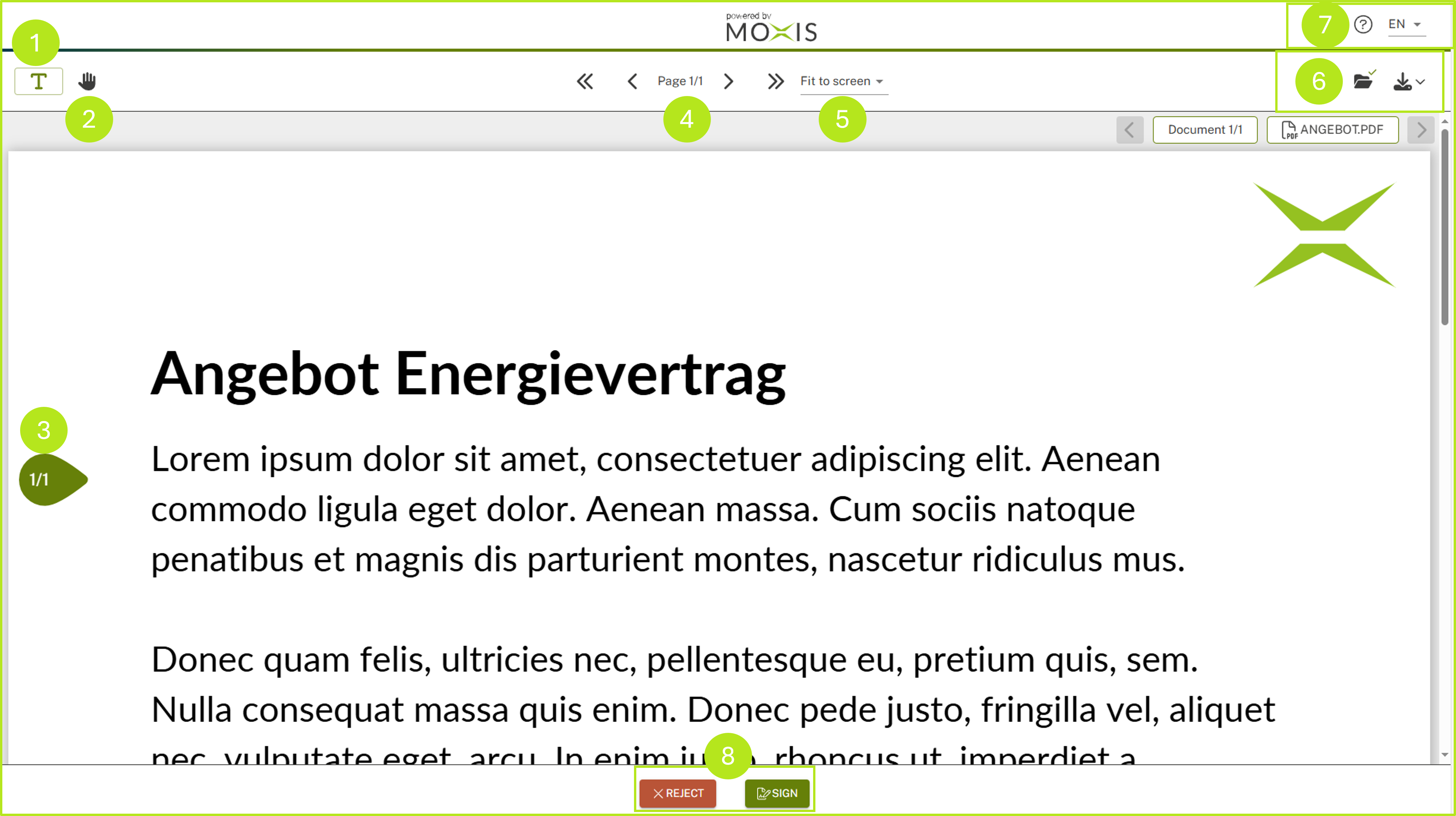
Figure 1: MOXIS Guest user interface in standard design
1.2. General user guidance on the mobile phone (responsive design)
The following figure (see figure 2 [1] - [6]) shows how user guidance on the mobile phone changes with responsive design.
(1) Burger menu (see figure 2 [1]): Click on the burger menu to access further functions, like:
Highlight text
Click to pan around the document
Zoom in
Zoom out
Fit to screen
Switch to the next field
Download current file
(2) Help-Seciton (see figure 2 [2]): Clicking on the question mark will take you to our help page.
(3) Language selection (see figure 2 [3]): Clicking on the language selection allows you to change the language.
(4) Check documents (see figure 2 [4]): By clicking on the Check documents and attachments icon, you can check documents.
(5) [Reject] button (see figure 2 [5]): Click on the [Reject] button to reject a document.
(6) [Sign]-button (see figure 2 [6]): Use this to sign a document.
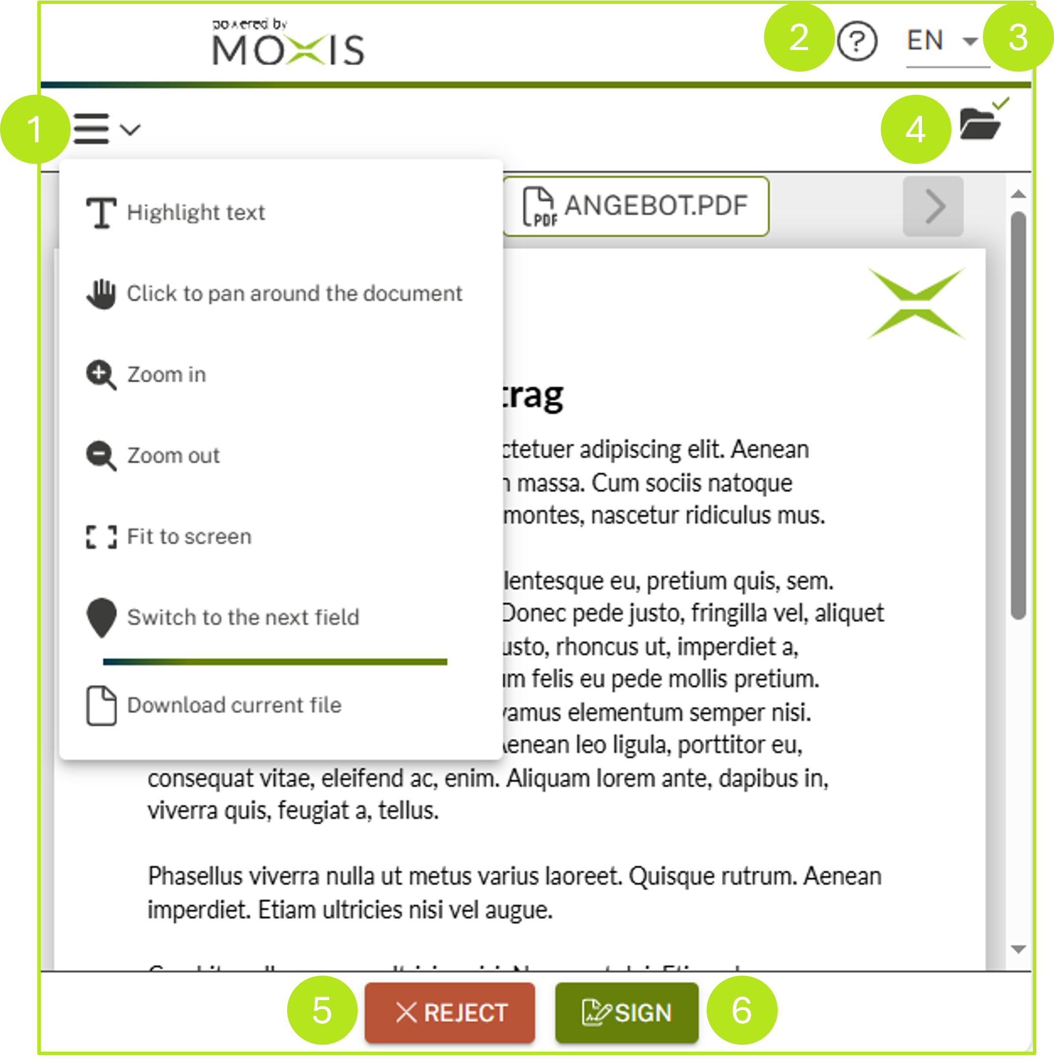
Figure 2: Changes to user guidance in a responsive design
1.3. Detailed view in the desktop variant
On the desktop, the detailed view of an order looks like the one shown in figure 3 [1]. You can find more information about the detailed view in the desktop variant here.
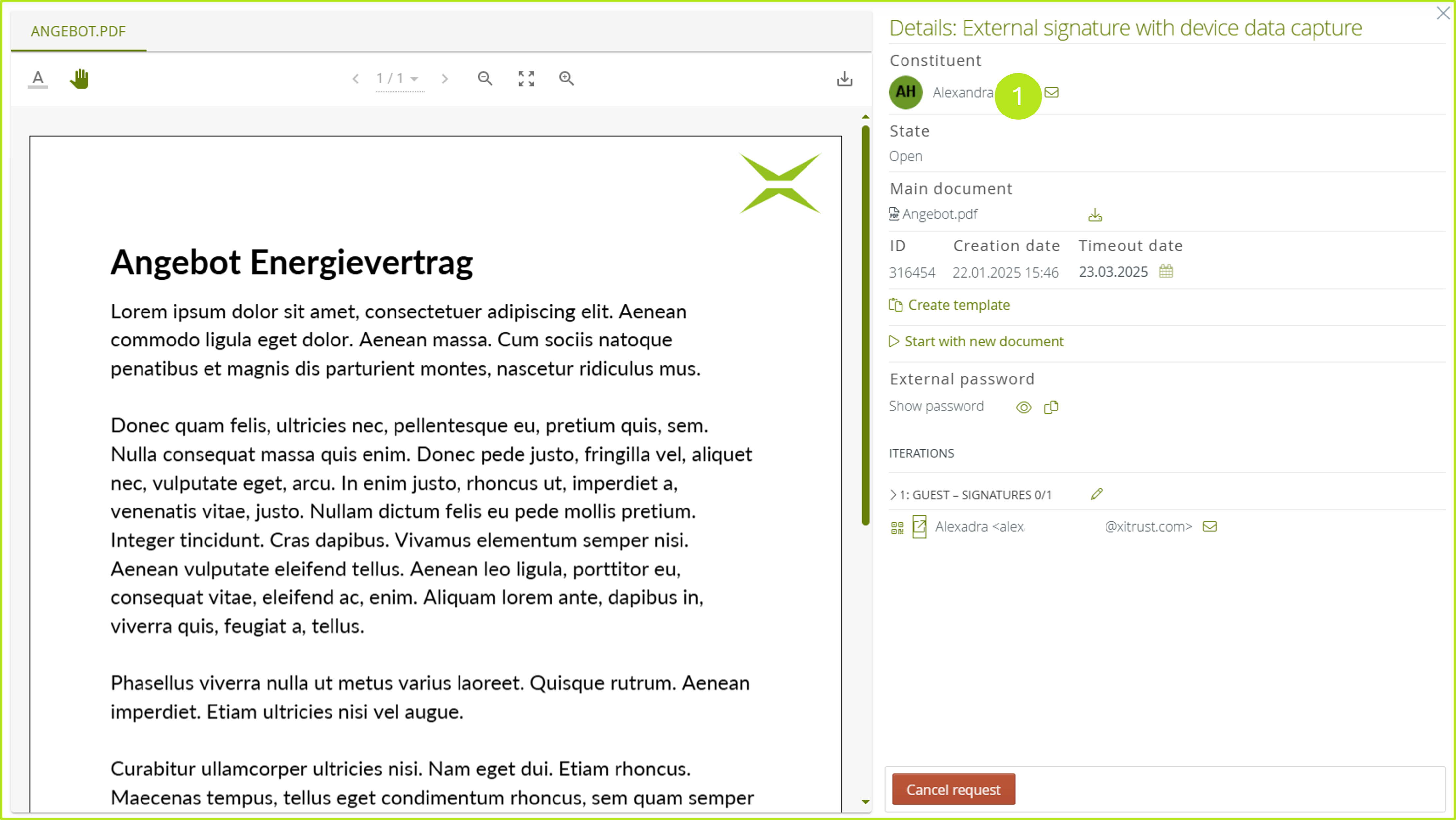
Figure 3: Detailed view of an order in the desktop version
1.4. Detailed view on a mobile phone (responsive design)
The following illustration (see figure 4) shows how the user guidance for the detail view changes on a mobile phone (when in responsive design).
Clicking on the info icon (see Figure 4 [1]) opens the detailed view of an order in a responsive design.
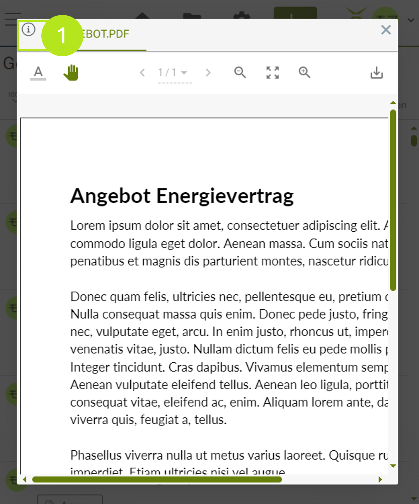
Figure 4: Open the detail view in responsive design
You now have access to the detail view in responsive design (see figure 5). It contains all the functionalities of the desktop version. Click on the [< Go to documents]-button (see figure 5 [1]) to return to the document overview.
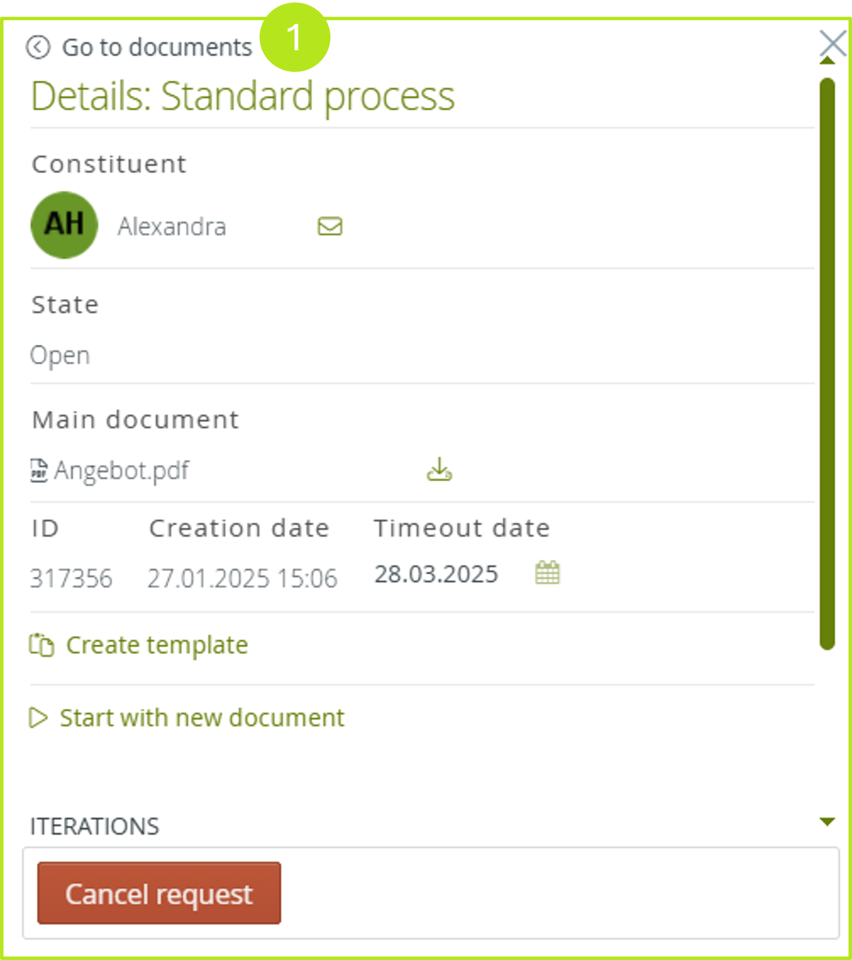
Figure 5: Detail view in responsive design